ShopDreamUp AI ArtDreamUp
Deviation Actions


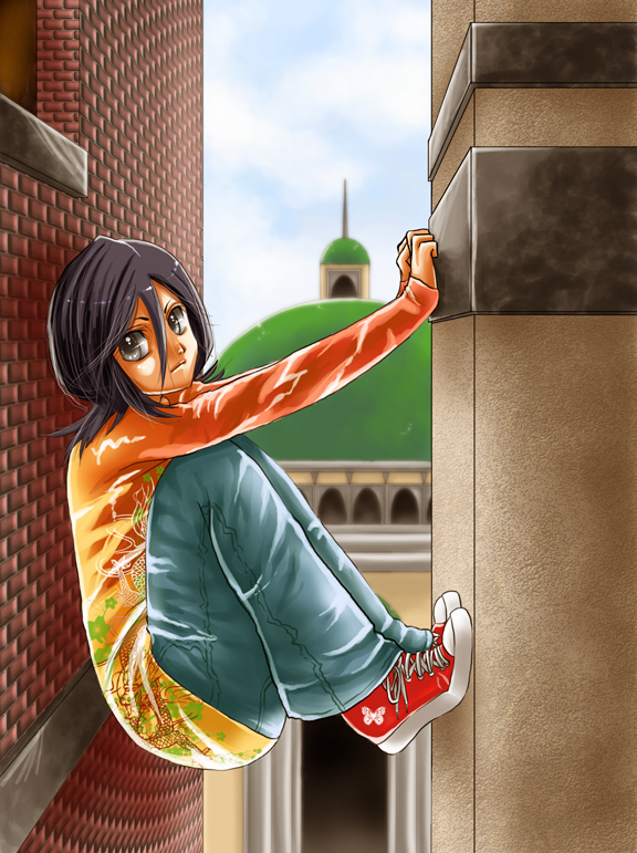
Description
In the space separating (two points, objects, etc.)
Kuchiki Rukia is a copyright of Tite Jubo.
If you life this deviation you may also like want to checkout my other deviation based on “Letter” and “Word” theme as listed below:
A is for Above: [link]
B is for Between: [link]
B is for Balance: [link]
C is for Crossover: [link]
C is for Confront: [link]
C is for Call: [link]
C is for Couple: [link]
D is for Draw: [link]
D is for Dance: [link]
F is for Found: [link]
G is for Group: [link]
K is for Kneel: [link]
K is for Kiss: [link]
N is for Nobodies: [link]
P is for Patients: [link]
P is for Pretty: [link]
P is for Pajamas: [link]
I is for Intimidate: [link]
H is for Hold: [link]
L is for Loyal: [link]
T is for Together: [link]
T is for Think: [link]
U is for Uncensored: [link]
R is for Relax: [link]
S is for Slouch: [link]
T is for Tuxedo: [link]
J is for Jacket: [link]
W is for Wait: [link]
V is for Vote: [link]
Image size
576x771px 410.08 KB
Comments180
Join the community to add your comment. Already a deviant? Log In
Hey there! This is a wonderful piece, so I totally needed to write a critique for this. Sorry if it's too long-winded, but I like to break down my critiques into four parts so that you know why I gave that rating for the corresponding category.
Well, here we go!
Vision:
Nice job! The anatomy seems about right, the shading is fantastic (SO LOVELY AND SHINY :'D) and the background looks like a lot of work has gone into it. So I think the visual aspect of this is pretty good. There were a few things that bothered me, though.
For example, if you look at how she's positioned, she really looks kind of... loose... if you know what I mean? I mean, it seems like she's going to slip. I think she should be tighter, or her back should be stiffer and less 'round'. Also, what I find funny is how she's smiling in such a scary position. Oh, well. It's not real life so that's possible! lol. XD
Another thing that I noticed is that the shading on Rukia seems to be really different from the shading in the background. To me, it seems as if she was traditionally shaded while the background was digitally done. I don't know. Maybe because she's got a lot of unnecessary white. Now, that white wouldn't seem unnecessary if the background had just as much, but maybe that's just me.
So I'll give you a 3.5 / 5 for vision.
Originality:
Pre-tty original! Nice concept. Sure I've seen the alphabet thing being done a few times, but that doesn't affect the originality of the actual piece whatsoever. Not much to say for this, except nice job! It;s fresh and original. <img src="e.deviantart.net/emoticons/w/w…" width="15" height="15" alt="
So I'll give you a 4.5 / 5 for originality.
Technique:
Nice. You worked patiently throughout the picture, or, at least it SEEMS that way! <img src="e.deviantart.net/emoticons/x/x…" width="15" height="15" alt="
I'll give you a 4 / 5 for technique.
Impact:
It has a really nice overall feel, although I can't see the meaning of the picture. Why did you draw it? What did you mean by drawing 'between' or drawing someone between something? Sure, it's portraying an aspect of the letter 'B', but what do you want to viewers to feel? So I'm not really sure what kind of an impact it had on me, it's kind of unclear. But it has a wonderful overall effect...
...So I'll be giving you a 3.5 / 5 for impact.
That's about it!
Hope you didn't find my critique too critical or long and tedious! That's just the way I tend to write. But overall, nice job! I really liked this picture. <img src="e.deviantart.net/emoticons/h/h…" width="38" height="15" alt="